Color psychology in interior design significantly affects the mood and well-being of those spending around 87% of their lives indoors. This branch of study explores how various hues, from primary colors to subtle shades like white, can evoke a spectrum of emotional responses, making the choice of room colors pivotal in creating desired atmospheres within a home or workspace.
Incorporating the psychology of color into interior design involves a strategic selection of color combinations, including complementary colors and color palettes that enhance the functionality and perception of each space. From peaceful bedrooms to energizing living areas, understanding the influence of color psychology can transform a home into a harmonious sanctuary that reflects and nurtures the occupants’ moods and preferences.
Understanding Color Psychology

Color psychology is a pivotal aspect of interior design, influencing mood and emotional well-being significantly. Each color carries unique psychological implications, which designers can harness to create desired atmospheres within different spaces.
Different Colors and Their Psychological Impacts
- Red: Often associated with passion and energy, red can elevate a room’s energy, making it vibrant and dynamic. However, it’s known to increase heart rate and blood pressure, suggesting its use in areas requiring vitality and enthusiasm.
- Blue: Known for its calming effects, blue is ideal for bedrooms and bathrooms where serenity is cherished. Although beneficial, excessive blue, especially at night, might disrupt sleep patterns by affecting natural circadian rhythms.
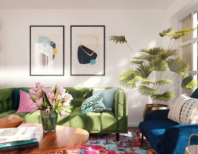
- Green: As the most restful color for the eyes, green brings tranquility and health, making it perfect for almost any room, especially where relaxation or concentration is needed.
- Yellow: This color radiates happiness and creativity, making it suitable for kitchens, playrooms, and anywhere you need a burst of optimism and inspiration.
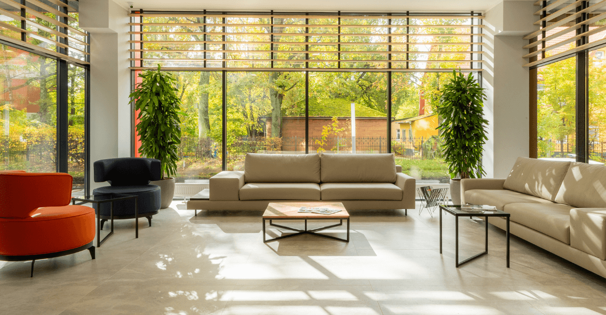
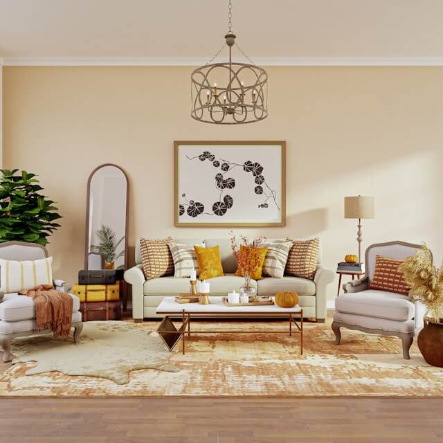
- Warm Colors (Red, Orange, Yellow): These hues are stimulating and can invigorate spaces with energy and warmth, suitable for social areas like living rooms and dining spaces.
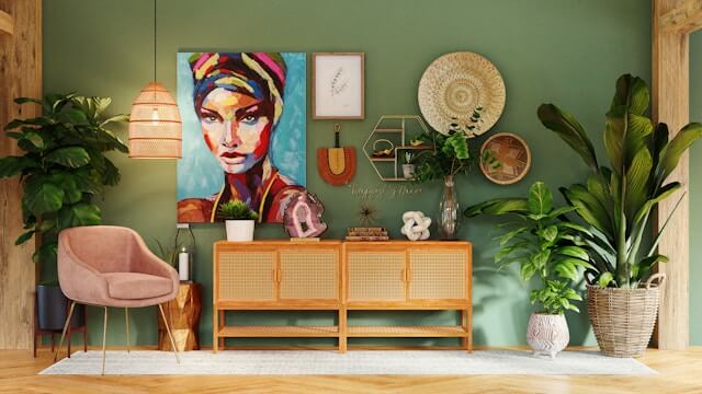
- Cool Colors (Blue, Green, Purple): They are soothing and provide a calm backdrop, ideal for personal spaces or areas meant for relaxation.
- Neutral Colors (White, Gray, Brown): These colors offer flexibility, stability, and calm, serving as a perfect foundation that can be accented with vibrant colors to balance the overall palette.
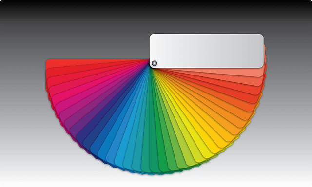
The Color Wheel and Color Properties
- Primary Colors: Red, yellow, and blue are foundational and can be mixed to create a wide range of additional colors.
- Secondary and Tertiary Colors: These are derived from the primary colors, each bringing its own mood and feeling into a space.
- Color Properties: Adjustments in tint, shade, tone, value, saturation, and chroma can dramatically alter the psychological impacts of a color, allowing for fine-tuning the mood of a room.
Understanding these fundamentals allows designers to strategically select colors that not only beautify a space but also enhance the psychological comfort of its occupants.
The Emotional Influence of Color in Home Spaces
Colors in interior design do more than just please the eye; they elicit a wide range of emotional responses that can significantly impact the mood of home spaces. Here’s a detailed examination of how different colors influence our feelings and perceptions within our living environments:
- Natural and Artificial Lighting Effects on Colors:
-
- Natural light enhances the vividness and saturation of colors, making spaces feel more alive and dynamic.
- Artificial lighting varies; incandescent lights add a warm, yellowish glow enhancing coziness, while LED and fluorescent lights offer a cooler ambiance, affecting how colors are perceived in a room.
- Emotional Responses to Color:
-
- Red stirs up energy, passion, and intensity, making it ideal for areas that benefit from high energy like dining rooms.
- Blue, known for its soothing properties, is perfect for creating a calm and serene atmosphere, suitable for bedrooms and bathrooms.
- Green, balancing and restorative, is versatile for any room, promoting tranquility and well-being.
- Yellow, bright and cheerful, stimulates happiness and creativity, excellent for kitchens or any creative space.
- Neutral tones like white, gray, and beige offer a backdrop of calmness and can make spaces appear larger and more open.
- Cultural and Personal Influences:
-
- Cultural backgrounds and personal experiences can deeply influence how individuals perceive colors. For instance, while white is often associated with purity in many cultures, it might represent mourning in others.
- Personal associations with certain colors can also dictate one’s emotional response, making color choice a very individualized decision in home decor.
By understanding these aspects, homeowners and designers can use colors not just for aesthetic appeal but as a tool to enhance the emotional quality of the spaces we live in.
Choosing the Right Color Palette for Your Home

When selecting the right color palette for your home, it’s essential to consider the atmosphere you wish to create, the dimensions of your space, the furnishings you will use, and the available light sources. Here are some practical steps to guide you:
Step-by-Step Guide to Choosing Your Home’s Color Palette
- Assess the Natural and Artificial Light:
-
- Observe how both natural and artificial light interact with colors in your space at different times of the day. This observation will influence your color choices, ensuring they complement the lighting conditions.
- Define the Desired Atmosphere:
-
- Decide on the mood or atmosphere you want to evoke in each room. For instance, a bedroom might benefit from calming shades like soft blues or greens, while a study might need more concentration-enhancing colors such as muted yellows or earth tones.
- Consider Room Size and Layout:
-
- Light colors tend to make small rooms feel bigger and more open, whereas dark colors can give large spaces a cozier feel. Use this to your advantage when selecting colors.
- Choose a Color Scheme:
-
- Decide between monochromatic, analogous, complementary, or triadic color schemes based on your personal style and the room’s function. Each scheme offers a unique aesthetic and emotional impact.
- Apply the 60/30/10 Rule:
-
- For balanced decor, use three color values: light, medium, and dark. Apply them in the ratio of 60% (dominant color), 30% (secondary color), and 10% (accent color) to create a harmonious look.
- Personalize Your Palette:
-
- Incorporate colors that reflect your personality and lifestyle. This customization makes your home not only stylish but also a true representation of your personal taste.
- Test Your Colors:
-
- Before finalizing your palette, test paint colors, fabric swatches, and flooring samples in the intended space to see how they look under different lighting conditions throughout the day.
By following these steps, you can effectively choose a color palette that enhances both the beauty and functionality of your home, creating a space that is both visually appealing and emotionally resonant.
The Impact of Color on Room Functionality and Perception
The strategic use of color in interior design extends beyond aesthetics, profoundly influencing both the functionality and perception of spaces. Here’s how various color applications can transform room dynamics:
- Size Perception Through Color Contrast: The contrast between light and dark colors can dramatically alter a room’s perceived dimensions. For instance, darker colors absorb light, making spaces appear smaller and cozier, while lighter colors reflect light, enhancing spaciousness.
- Ceiling and Wall Color Effects: Color choices for ceilings and walls can manipulate spatial perception. A dark-colored ceiling gives the illusion of a lower ceiling, creating a more intimate atmosphere. Conversely, painting walls dark and the ceiling white can make the ceiling seem higher, adding a sense of volume to the room.
- Visual Pathways with Color Placement: Strategic color placement can guide the eye and change room shape perception. Painting the back wall and ceiling the same dark color, while keeping side walls lighter, can make a space feel wider. Alternatively, dark side walls with a lighter back wall and ceiling can make a space appear narrower.
- Creating Intimacy with Dark Tones: Employing dark tones on a room’s back wall, contrasted with lighter colors elsewhere, can make a large space feel more enclosed and cozy. This technique is particularly effective in oversized living areas where a sense of intimacy is desired.
- Focal Points Through Light and Dark: A lighter-colored wall amidst darker tones can draw attention and create a focal point, adding depth and interest to the room’s design.
- Height Illusions with Color Gradients: Applying a darker shade at the bottom of the walls can visually shorten them, which is useful in rooms with disproportionately high ceilings.
- Dramatic Effects with Color Mixing: Combining light and dark shades can prevent interiors from appearing monotonous. This mix not only adds a dramatic flair but also balances overly bright or dark spaces.
By understanding these principles, designers and homeowners can use color not just as a decorative tool, but as a strategic element to enhance the functionality and psychological comfort of living spaces.
Combining Colors for Harmony and Contrast
Combining colors effectively in interior design not only enhances the aesthetic appeal of a space but also influences its emotional atmosphere. Here are some strategies to achieve harmony and contrast, ensuring a balanced and visually interesting environment:
- Complementary Colors: Utilize colors that are opposite each other on the color wheel to create striking contrasts. This approach can energize a space and bring vibrancy to the decor.
- Analogous Color Palette: Choosing colors that are adjacent on the color wheel can create a serene and harmonious look. This method involves blending similar hues, varying in tones and intensities, to produce a subtle yet cohesive space.
- Monochrome Elegance: Employing different shades and tints of the same color can achieve a sophisticated and refined look. This technique is particularly effective in creating a calm and unified environment.
- Texture and Style Diversity: Incorporate a mix of materials such as wood, metal, glass, and fabric to add depth and interest to the room. Combining various furniture styles can also enhance the uniqueness of the space.
- Highlighting Key Elements: Use color to spotlight important features in the room, such as artwork, furniture, or architectural details. This focus helps in crafting a cohesive design narrative around these elements.
- Proportional Balance: Maintain a balanced distribution of elements using design principles like symmetry or the rule of thirds. This ensures that the space does not feel cluttered or overly sparse.
- Simplicity in Design: Edit out unnecessary items to avoid a chaotic look. This simplification helps in emphasizing the chosen color scheme and maintaining visual harmony.
- Pattern Play: Integrate patterns carefully; ensure they complement the overall color scheme and are spaced well to prevent a cluttered appearance. Mixing patterns with solid colors can help in achieving a balanced look.
By applying these principles, designers can create spaces that are not only visually appealing but also emotionally resonant, making color a powerful tool in interior design.
Practical Tips for Implementing Color Psychology in Your Decor

Window Treatments and Color Impact
Window coverings such as drapes and blinds are not only functional but also pivotal in defining the aesthetics of a room. They can significantly influence how color manifests in your interior design, bringing vibrancy and life to the space.
Rhythm in Design
Creating a cohesive color palette involves the principle of rhythm. This is achieved by repeating shapes, colors, patterns, and textures throughout a space, which helps to create a sense of cohesion and harmony.
Alternatives to Paint
Changing up the color scheme of a room doesn’t necessarily require a fresh coat of paint. Consider using removable wallpapers, colorful decor items, or vibrant furniture pieces to inject new life into your space without permanent changes.
Color Theory Considerations
Before undertaking a major repaint, remember that the effectiveness of color theory is not guaranteed. It’s wise to test colors and gather feedback to ensure the chosen palette achieves the desired psychological effects.
Metallics and Accents
Incorporating metallic colors and accent pieces can be a stylish way to enhance excitement or creativity within a room. These elements can serve as focal points or complement the overall color scheme.
Strategic Color Combination
Combining colors wisely is crucial as it can either enhance or dilute the psychological impacts you aim to achieve. Consider the emotional weight of each color and how they might interact within your space.
Testing and Feedback
Colors can appear differently depending on the medium and lighting conditions. Always test your chosen colors in the actual environment where they will be used and solicit feedback to avoid unintended effects.
Expert Consultation
For personalized advice tailored to your specific needs and preferences, consulting with experts can be invaluable. Services like Mavyn provide both AI and human expert guidance on implementing color psychology effectively in your decor.
Conclusion
Through this exploration of color psychology in interior design, we’ve unraveled the profound connection between color choices and their impact on our mood and well-being. By understanding how different hues influence emotions and perceptions, we can transform our living spaces into harmonious sanctuaries that not only appeal to the eye but also nurture the soul. The strategic application of color theory, from vibrant living areas to tranquil bedrooms, underscores the significance of thoughtful color selection in creating functional, aesthetically pleasing environments that reflect and enhance the occupants’ lifestyles and moods.
As we move forward, the importance of integrating color psychology into our homes becomes undeniable, offering a foundation for personal expression and psychological comfort. The guidance outlined in utilizing color palettes, understanding their effects under various lighting conditions, and the detailed examination of colors’ emotional influences, equip us with the knowledge to make informed design choices. Encouraging further research and personal experimentation with color will foster environments that not only look remarkable but feel genuinely resonant with the individuals inhabiting them, ensuring that our spaces are not just places of refuge but also sources of rejuvenation and inspiration.